Pages

Showing posts with label EN. Show all posts

Sunday 1 July 2018

JOHN SINGER SARGENT - "greatest painters that grazed our planet" series

Hi there All you good people of the internet,

Here I did a blog post about one of the greatest painters of all the times in Czech Language. I did it mainly because there's not so much information on the man in Czech. But there was a request by one of my friends from UK, Pat, to make it in English so here it is. There's a myriad of info about Sargent but this could be considered my personal view on his work and his approach and why I think he was so invaluable. 

I mentioned in the Czech version that a lot of Czech people have a good understanding of two well known artists that came from Czech Republic which was Alphons Mucha and very prolific illustrator Zdenek Burian, but I will mention them in detail in the future. 

John Singer Sargent was born on 12th of January 1856 and died on 14th of April 1925. An american painter which had earned his formal classical art education in Paris in the famous Ecole des Beaux-Arts. He later became one of the most admired portrait painters in the high society in Europe as well as in USA. He was a pupil of Carolus Duran. John is considered to be a "Brown school painter" who painted mostly behind closed door - indoors, where there's muted colours of any given object, emphasising more value changes and so called Chiaroscuro (difference between light and shadow) 

After many years of making portraits of American, England and Parisian high society John became little bit sick of doing his craft. I think He had started to hate commissions so he decided then to travel more and to grab his stuff outside. He used oils outside as this was his primary medium but he oftentimes switched to watercolour for its rapid nature and easy to carry properties. The result was a impressionistic usage of colours - more vivid due to the sunshine outside, without loosing sense of three dimensionality of a brown school painter. His outdoor work I dare to say is maybe twice that better than any of the famous impressionistic painters as we know them (Degas, Monet etc.) - it is mainly due to the Sargent's stellar drawing skills and his sense for Value and structure that he was able to maintain in his outdoor work when applying very truthful colours the same way impressionist did. 

Here's some examples of John's work with my commentary with some explanation to make sense (or justify) about my commentary above:


This is to be considered as an oil sketch. Keep in mind that artist of these times seldom used photography. Which was actually a good thing for honing their skills which John represents strongly here. It was at most one hour sketch done rapidly due to the fact that model looks rather annoyed to stand in the wind :-) Painting is a typical example of the freshness of John's brush strokes and a strong connection of his brown school training and impressionistic colours. 


I'm intentionally picking out an unfinished work, because they can reveal the process of painting itself the best. This sketch in oil indoors is a classic example of the freshness of brushstrokes as we spoke about. He follows the form with his brushstrokes in the lit areas and simplifies shadows to pronounce the focal point (the eyes of the sitter). As you can see to emphasise the focal point even further John uses more simplified brushstrokes that borders with abstract art on the outer sides of a painting to literally nudge us to look the subject in the eyes.


This is a gorgeous lecture on composition by John. If you squint at 50 precent you can see nice abstract shapes that underline the whole painting - the black stripe made out of musicians, focal point of the garment of the dancer. Dancing shadows on the wall are just cherry on top which finishes the whole orchestra. 


Autoportrait. This is an
 example of John's style that he used throughout his carrier for portrait commissions.  Indoor painting with strong (light vs. shadow) Chiaroscuro contrast. The fresh and effortless effect is just an illusion. It actually exists a myriad of letters and notation from John himself how hard and gruesome the process sometimes was. More on that notations and even more other information could be found in a great post by Howard Lyon from muddy colours 


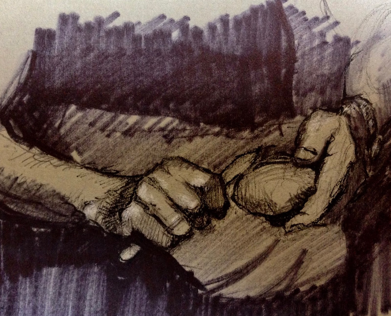
And finally his alligators having an afternoon nap - maestro work with watercolour. This is exactly an example (and you can find another billion of others :-) ) why I think John Singer Sargent surpassed all the impressionistic movement. Reason being that he was able to masterfully combine his brown school education (drawing, strong sense for chiaroscuro) which most of the impressionists lacked and his sense for impressionistic colours. His quality and handling of colours was up to par with the French movement. 

Simply put Sargent was just a master. One of the kind. This is not to say that he was the best. There's no absolute in art I think. But he was one of the best in what he was doing. If you would have anything in mind regarding my take on this prodigy I would be more than happy to answer possible question or to have a discussion.

Sincerely Pete. 


Saturday 23 June 2018

Mirror instead of life drawing sessions

Yesterday I woke up at 4 am and didn't want to sleep. It was 45 minutes till my alarm clock would ring so I decided that I would use the time given to me for sketching. I took some old cardboard paper (it has a nice toned and sturdy surface) fountain pen and white chalk. There's a mirror on my drawing table and I was lazy to put clothing on my self so I saw the opportunity to do some anatomical studies on myself.

Mirror gives you analogical interpretation of a depicted object the same way as seeing things from life.You have the same optical experience as you would have being drawing from life figurative sessions. It is a far more better option than working from photos, that could give you false illusion. Mainly it is a shape transition that you have within your subject. Analog mirror gives you far more wider range of edges starting from crisp edges - cast shadow or the edge between foreground and background in some cases, firm edges, soft and lost ones. Photograph has a tendency to flatten down the picture and make things more in focus.

To name all the benefits: If we work from life we have truthful information about edges as I mentioned above, we can see more information in the shadows (photography has a tendency to make shadows more dark a duller, and we see more saturation and chroma in the highlights (photography makes it more whitish)

If you don't have life figure classes in your town (in our city of Zdar nad Sazavou we definitely don't have any) or you don't have time to commute all the hours to get there mirror is a great servant. Your spouse should make a same service if she/he's willing to pose for some time...

I was ready to draw 3 minutes right after I'd woken up. This is really beneficial because it frees you up from decision making - It is just so easy that you can't say no to do that. After 45 minutes I ended up with 3 sketches.

To draw with pen and ink is a great option - you're forced to make decisions that you don't have the option to change. You just don't fuss around. Pen and its linear nature supports your need to describe the form and shape in 3D and forces you to focus on high quality STRUCTURE - Which is one of the two most important pillars of drawing.

With that saying it is not good to forget about GESTURE which should precede STRUCTURE and because the ink isn't erasable your gestural lines will show trough from your drawing. This could serve you down the road after several years even, when you can check how you'd been thinking about gesture and what has improved or what hasn't. It is like a mirror in to you past. Believe me that this scratchy, charming sketches will be well cherished after many years!

Here's my sketches:


If you would like this kinds of articles please don't be shy and write a comment in the comment section. You can suggest what you would like to hear about next or leave a suggestion what to improve.

You can also check my official website

Pete 

Wednesday 20 June 2018

2 MOST IMPORTANT PILLARS OF DRAWING

Hi there again!

I've just made a promise to myself that I will be writing every 20 minutes after I finish my every meal so you can look forward to read more articles from me (I eat a lot and often :-)). I set the time limit for 20 minutes to make this habit gradually and not to fire out after a few days.

Today, I would like to talk about two basic pillars of drawing and painting and representational art in general which I think you US and English speaking folks are maybe more familiar with than my brothers in the Czech Republic. I think that the main reason is that there's a lot more out there in therms of literature and resources on the web in English than it is in my native language. That is the reason that this very article is already released in Czech version on my blog.

The main two things to look out for when drawing and painting is:

GESTURE
STRUCTURE

I did not come up with it of course, I learnt this from my cyber-mentor Steve Huston, Stan Prokopenko, Jeff Watts to name a few. It is a basic idea of what the picture is all about when it comes to its foundation (another basic and vague Idea is composition but I will write about it in the future. Let's focus on the topic for a today's article:

GESTURE simply speaking is the fluidity, gracefulness of depicted subject. It is a basic "watery" idea of everything that is organic or alive. It is a graceful connection of the parts, it is a wholeness. We consist from 90 precent or so of water. GESTURE is the energy within us. As an analogy in music it is a whole composition, whole song with a massage to deliver. In dance it is the whole show.

Fir. 1. Examples of my gestural sketches. It is a good habit to set yourself a timer for 1 or 2 minutes to be forced to express only the motion within your object (in my case the figure). Just to be forced to express essentials.


If I were to describe STRUCTURE simply I would say that structure is the 3D feel of the subject of all the parts of it. It is a architecture of the subject. We try to describe it with the width, length and depth of a subject as soundly as we can with all the limitation that we have - 2D paper, canvas, mural wall. With structure we try to make an illusion of a 3D feeling on the flat surface.

There's miriad of tools to do that and I hope I'll be able to deliver all of them (or the majority of them) in the future posts. 

Fig.2 My structural studies on the example of the arm and the thumb. As you can see in the arm example there are still visible so called "ghost lines", these are representative of the gesture that preceded the construction it self. From this we can say: GESTURE COMES FIRST! (those drawings are made on the basis of teaching by mr. Steve Huston)


Gesture is really the hardest part to jolt down. It is the most ethereal factor of the subject it is a right brain, subconscious feel for the figure or landscape or still life or animal to anything else. You have to try to find a long axis within your subject. The most energetic wave sort to speak. It is learnable but I believe it is a lifetime pursuit (again actually I've started to believe that based on the people that I admire - Steve Huston, Jeff Watts, Richard Schmidt, Sargent, Stan Prokopenko and the list could go forever! and I've started to believe that based on my practise also)

Structure is more logical pursuit to handle. We should study how to distill down a particular subject in order to describe the form - the structure - the architecture. In the case of human anatomy we should study how to convey any particular part and pose of it. There's a lot of literature how to do that and it is a great habit to have - just spent an hour or so studying (actually drawing) how to draw a hand, leg for example or how to convey house in perspective end so on. 

In the case of a human firuge and portrait I highly recommend to check Stan's Prokopenko  channel.
In the case of books I would start with Andrew Loomis's books (all of them)

Here's the side note:

In the art there's no rules there's only tools (Glenn Vilpu). If someone is a lot dogmatic about something be wary of that and always try to have some distance from the saying and use your conscience and independent will to decide if there's something useful about that saying. I want you to have this in mind for my future posts as well any time when I try to pass on some wisdom. Art Ain't dogmatic and that's a luxury that we artists have.

With that I want to say about this GESTURE - STRUCTURE relationship that the GESTURE COMES BEFORE STRUCTURE. It is wise to always find a gesture first - loose lines of action and put structure on top of it. It is the very essence of it and this relationship makes actually a lot of sense. 

With that goes another warning - gesture-structure relationship is a balancing act - If we have to much of a gesture and no structure picture may look hazy, flat and without sense of depth. On the other hand to much structure can feel rigid and your graceful lady can end up looking like a Frankenstein. 

Uff. That would be all from me for today. I think there's always something to say or discuss in the realm of art so if you would have a suggestion for a topic to cover or some ideas to add into a topic please feel free to express yourself in the comment section. 

If you want to be updated every time I put something new on the blog sing up for a newsletter on the right sidebar. Just put in your e-mail and you will be in touch.

Pete


and now just headphones (Tim Ferriss), coffee and a comic book making since there's a deadline

Monday 18 June 2018

More "How to draw" blog posts for the near future!

Hi there to you all, good brothers and sisters,

It's been a while (half a year) since I wrote my last blog post here about how I work and what I think is the fundamental principals if one wants to create representatively- meaning how to draw, paint or otherwise depict things that we are somewhat familiar with. I can't speak about abstract art (although there's a place for it in representational art as well but about that another time! )

Till now this blog has been purely in English but I decided to make it bilingual for sake of my brothers and sisters from Czech Republic. Yes, you guessed it - the second language of this blog is Czech (Since I'm a proud Czech citizen and I'm somewhat proficient at it) If you would be interested to look at the writing in this language (at least for laughs that you're not able to discern a single word), you can check the right side bar at the top for a language switcher. 

This blog is about what I do, how I do it a why I do it and WHY! it could be a good thing for you to do as well (benefits as calming down, letting out all the stress from hard day's work and maybe to have something to hang on the wall in your bedroom)

I also love to talk about life in general - you know - philosophy of art, psychology in turning things around (you know I was a construction engineer that burn out heavily) and so on. 

For those who don't know me yet (majority of you), you can check my official website:

https://stranikart.com/en/

WHAT DO I DO IN THE MOMENT?:

As a freelance illustrator I'm currently working on a comic book in collaboration with comic book freak (in a good sense) from Prague named Jonas Ledecky. If you're not familiar with Jonas you can find him here:

https://jonasledecky.myportfolio.com/work

We should release the comic book sometime in the heat of the summer - it is not set in stone yet but I definitely should be done with it around this time. Comic book is based on the famous Czech Writer -  Karel Čapek and his detective short stories from the 30's called "Povídky z jedné a druhé Kapsy" (It is a mouthful isn't it? :-) ) 

Jonas is a comic book freak which I admire a lot in him. You know comic book is a brutal area of creative endeavours. You have to rely heavily on your imagination and that's hard and painful believe me. In future posts I will touch on this topic how I make this things easier (or try to). Since this is a blog about visual creations I attach some panels from the short story that I'm about to deliver:


Night scenes would be on the dark bluish background and all the scenes within daylight would be with an ochre fill. Highlights would be brought out by adding white to simulate the work on toned paper (Although it is a digital colorising). I ink the drawing by hand mostly using black ink and fountain pen. 

So that's all for now. I wanted to check up with you and tell you that we can have an interesting relationship in the future where I can share some useful tips with you about my creative process maybe to give you an idea for your work or maybe to selfishly receive some suggestion from you how to improve my work further. I hope for a mutual artist's relationship and that we will engage together in foreseeing future. 

Best regards, Petr

Monday 1 January 2018

My First Imaginative Fantasy Picture In Adobe Photoshop

I have always loved dragons, warriors, heroes etc in various fantasy novels and stories. One that stands out obviously is the whole franchise from middle earth. Recently I read one trilogy called "Summoner" by Taran Matharu and I have to say It was really refreshing and the plot and the whole universe is quite unique.

https://www.goodreads.com/series/130699-summoner

My picture is a scene that I imagined while reading the pages from the first book "The Novice" where the main character abandoned his home with his Imp that resembles a small dragon. In the scene Imp made a fire for our main character to get him little bit warmer.

I decided to do this work based on the story that haven't gotten so much artwork yet because It is quite new book and I didn't want to be biased in any possible way (If you think about it that's quite harmful in the case of LOTR movies - because now we have a firm picture about environment, scenes and even the appearance of characters in the given universe)

I started project with pencil on paper:


Sketch #1

This sketch and the one that follows were done from imagination. That is to say that I erase a lot and chase the idea quite religiously - It is not a loose sketch - I spent about an hour on each of these because of that. I would love to have that ability to sketch something in 5 minutes :-)

in the pencil sketch above Imp is right in action of spitting the fire and the whole composition is quite flat so I decided to give it a little perspective and since in the book the Imp is wingless I decided to put the wing out of the picture as well. After some thought I realised that it would be better to portray the scene as a "aftermath" with the fire right in the picture. For next stage of sketching I went right into photoshop - because erasing in this program isn't that cumbersome. 


Fletcher (the main character) and the Imp Sketch #2

From this sketch I proceeded to the final painting. I downloaded a loads of reference images - about dozen forests, fires, characters near the fire, dragons etc. I didn't rely on any given reference so much always striving to make the appearance my own. 

I have to say that painting and drawing from life is much more relaxing and easier than to make a scene completely out of your imagination. The most rewarding thing on this kind of work for me is the final product when your vision is somewhat realised. 

I have to say that in the original series the imp's appearance in "The Novice" book is lot more smaller and can actually fit behind your neck as a small ferret so I deviated a lot in this case. I used it only as a inspiration. 

So here's the final painting:


Fletcher and Ignatius (digital)

In overall I'm happy with a picture and the whole process of picture making. In the hindsight I have to admit that the first pencil sketch had more impact composition wise - it makes you think more about the scene out of the frame (the fireplace isn't included in the picture) and hence makes it maybe more interesting. Maybe the final painting is too literal..

What do you think? Let me know in the comments below.

Pete

Thursday 21 December 2017

About this time - Gratitude and feeling of contribution

Ahoy all you good people, how's the festive season working for you? I chose to give you heads up by "Ahoy" exclamation not because I would be some kind of marine enthusiast or some kind of pirate but because this exclamation is the closest one to Czech "Ahoj"

Recently I'm thinking about an idea to have my blog bilingual (English/Czech) but I haven't come with solution  yet how to put it in action. If someone would know how to do that here with Blogger platform I would be more than grateful!!

Since I pointed on the topic of gratefulness please let me give a chance to say that I'm so glad, that there's some people who enjoy my art and I can have that warm feeling of contribution. This year some of my paintings find a home in several places in United States due to the sales made through auction portal dailypaintworks.com 

It's nice to know that my "touch" can reach places like North California (in the case of painting called Chill, State of Georgia (painting called Spotted), Massachusetss (painting called Delivery), Connecticut (painting called Turban Fellow) and Texas (Hey a'll) (painting of John Scofield)

Some of the paintings on my dailypaintworks pages are not for sale, because I gave them away as gifts to my relatives or as a farewell "thank you" to my former chief. I also had a great commissions (portrait of dogs for my former employer)

I'm looking forward to put my efforts to make myself a better painter and to provide for art lovers more products with ever increasing quality. That feeling that someone loves your work and actually is keen to put a value on the effort is invaluable. I love doing my work and I love even more to see it hanging in someone else's room across a globe (like in this case)

I would not like this post to be a picture less post so here's my still life study (charcoal on paper):


Stay festive people, it is coming..Pete


Wednesday 29 November 2017

What to do if one's ill to "stay in shape"

Last week I had a flu. It wasn't anything bad, just clogged nose, slight fever but it was really hard to concentrate on any bigger endeavour. So I made just few sketches from my bed.

The first is done as a memory with a chat that I had in October with a principal of a JO-JOO circus that visited our town - mr. Jaromir Joo. I made some sketches of Siberian tigers over there (see my old post here)


It is in my watercolour/gouache sketchbook and is about 7x8 inches done in gouache. Picture is done from photograph that I'd taken before he allowed me to have a peek through the open window of the cage with his 600 pound Siberian tiger (To make my self a picture without bars of that cage). After that we had a chat about tigers and life in general. He is a clever fellow that has contributed to the rescue of Siberian tigers with 25 cubs bred within his circus.  

Second sketch is about 8 inches tall and it is from a photo of a miner from internet. In this case I worked with oils. It is hard to work from life if you're confined within your room in order to beat a flu out of yourself. Those sketches are means of staying "in shape" and not to forget your craft. With any given craft it's like a memory training or going to the gym - after while your skill can fade a bit if you don't use it often. 


This is not to say that I have acquired any sufficient skill for painting and drawing I just wanted to remain the skill that I have so far :-) Please notice that I'm aware that there is a long way to master my craft. I want to point out that I think it's important to maintain your skill (stay in shape) in some degree even if you feel like doing nothing. 

So stay in shape guys in whatever is your vocation. 

Pete


Wednesday 15 November 2017

NEW Painting - Winter's coming.

Hi all of you. I've been thinking that would be nice to share with you how I made my recent painting called "Winter's Coming"

I visited my brother's place on 31st of October to help him just a little bit with the wood that he uses for his heating. After some chopping and cutting I made a few pictures of him in the cellar making finer wood chips. So here's my reference:


I got pretty lucky that a picture in its self had a quite good staging. I tried to get myself going with ballpoint pen preliminary (plus white chalk on toned paper):


BW preliminary sketch for "Winter's coming"

While doing a sketch I realised that in order to tell the story and the movement i.e. "gesture" I have to emphasise few things - so I intended to do the hands and the axe little bit bigger to push them closer to the viewer and to suggest more movement in my brother's right hand. After that I proceeded to small colour study in oils:


Preliminary colour study for "Winter's coming (4x6 inches on canvas) (you can see a little bit bigger hands and the axe and action lines in his right hand)

For this study I pushed colours in his hat and in the axe toward green to compliment reddish colour of his trousers. I declared that a warm grey of the hoodie is ideal and it will support both compliments. After that I proceeded for a final painting.  


Winter's coming - beginning stage

Above is my beginning stage of the final painting. I started with a gesture, emphasising hands and the axe even more and putting even more movement to the whole body. I even tried to put more "air" into the back of the hoodie. I strived to have little bit cartoonish feel (something like Norman Rockwell). I would like to point on the fact that it is not about a mere coping of the photograph but more about telling a story and push your narrative as further as possible (but still maintaining believability) So this is basically the third time that I draw a picture freehand. 
As for materials side of things I used a MDF board with two coats of white gesso and final coat of transparent gesso with tooth which I like so much (I don't like it slick). I used water soluble oil colours Cobra and great brushes Rosemary and Co. As I worked I used my photo reference in BW for proportions and my colour study for my mixtures. 
Painting took about 3 days of interrupted work (I've got troubles to start - yep you have that right - procrastination) and I tried to stand the whole time in order not to lose sight of a whole picture and to maintain gesture within the picture - you can lose it so easily when you get into detail. 

Winter's coming (17x24 inches, oil on gessoed board)

I love this kind of narrative work. There's something familiar in it I think even for a person who never met my brother. I hope that picture can give you a feeling of home, warmth or maybe makes you think about state of mind of the subject (I made him look somehow mysterious)
My opinion is that it is not about a single interpretation but more about what you (my audience) can derive from it based on your experience, feeling etc. And that is so magical in art I hope and that's the reason why I love it so much.

Stay warm, winter's coming! Petr

Monday 13 November 2017

Evening news series No.III - quickie done from life within 1,5 hours

On this Friday the 10th of November I tested my new home-made field sketch easel in my parents living room, where I tried to depict my father watching evening news in this case . It has been done within 1,5 hours from life without any editing touches afterwards. I had that time range firmly set in the beginning of the session so that I was forced not to fuss about which I tent to do. The result is juicy application of the oil paint and a quick sketch that I'm quite happy about:


Father watching news (oil on board sketch)

It is really important to train oneself to paint from life, it will give you more confidence over time I hope. It's also more fun than photographs where you can't really soak in the character of your sitter. 
(More of a Evening news series here and here)

In the future post I will share with you how I made my sketch easel. 

Petr

Saturday 11 November 2017

Morning cuddle painting

Recently I gave you a suggestion which of the preliminary sketches should I use for a oil painting. I was a nerve wreck to already start with my lovely oil colours so I made my pick. Since I love to paint people and animals I picked as a topic of my painting my mother with her morning coffee (5am) whilst cuddling her cat Symba. I picked my mother again because I knew that I can do a better job than in the past (see posts: here and here) because those were a paintings for time (around 2 hours) and now I had more time since I was working from photo.

To remind you I used this preliminary sketches of the hot spots of the picture:


After I'd acquired feeling for the expressions of my subjects I started with painting itself on very heavy watercolour paper (600 gms) with two coats of white gesso and final layer of transparent gesso which gives you more of a tooth which I prefer for more detailed work.

Again big thanks to rosemary brushes - working with them is just pure pleasure.

Morning cuddle (oil on gessoed board 10x14 inches)

I really enjoy this kind of illustrative work with traditional media so you can look forward to see more of the work like this. (If you enjoy it of course)

Stay warm beside a nice hot beverage and make sure that you have someone/something to cuddle - winter's coming!

Petr  


Thursday 9 November 2017

Preliminary sketching

I love to sketch with ballpoint pen and white chalk on toned paper in order to find out which idea would work as a bigger painting and which not. Here's some of my sketches coming from various family members, the final sketch is about 4 by 4 inches in oils - it's my father peeling potatoes expression :-) )

Mother's cat


Father peeling potatoes 1st take


Father peeling potatoes 


My brother chopping wood (future painting "Winter's coming")


Mother cuddling her cat


My brother


Father peeling potatoes

We will see which one will make it as a bigger piece.

Have a nice November everyone..
Petr


Wednesday 8 November 2017

Common place sketches

If you have a time and you have some gouache/watercolour/pen and ink or whatever with you take your time to sit in front of silent/humble/sincere place in your home and appreciate the quiet quality of that place. You'll discover that time can fly while completely silent trying to convey the place on the paper. I try every now and then to sit down with my gouache sketch pochade box and do that very thing. This small pictures feature my "raised and born" house where I'm living right now after my arrival from England. 


It is on one sheet of 300gms watercolour paper (quite rough texture) witch is part of my pictorial pocket journal. Give me a nod via comment section if you want to see it in its wholeness. I can do a post or video which would run quickly trough all the pages...
I love common places like this, There's something divine behind the places like this....

Petr

Tuesday 31 October 2017

Portrait Of My Good Old Friend

On Friday night the 13th of October right after I finished this painting I visited our good old jazz club in Zdar to see my friends that I hadn't seen for a bit (as you maybe know I've spent past two years in England working). It was a cheerful event full of music (It was a jam session night - after some consideration and some wine I resumed to play some old tunes too - it was awful I have to admit :-) ). But most importantly I met a friend that I haven't seen for a while - a great singer and fabulous conversation buddy Zuzana (she likes to talk about life and its meaning and I dig this topic a lot!) So I invited her to come over on Saturday to just talk about life whilst painting her. And She agreed!
It was my third oil portrait attempt in three back-to-back days, big challenge as well - soft light plus young flawless face without wrinkles is deadly combination.

In the first BW picture you can see the setting at the end of the session (3 hours) with her proportion slightly off (I blame her for getting me distracted because all of those interesting topics that we had been discussing :-)


Finished work at the end of the session with Zuzka in my vista

I got a break from the painting till the evening that day. I put my photo on BW to force myself to use colour just from my mixtures done on my palette and adjusted her proportion accordingly. So here's the final painting:


"Zuzka" (oil on board 11x14 inches)

Do you have any suggestion, tips etc how to stay alert and present while doing a life portrait and having a conversation with a subject at the same time? I find it very challenging!

But challenges are here to be overcome so everyone near Zdar who would have some free time is welcomed in my humble room to sit for me!

Sincerely Petr 


Sunday 29 October 2017

Colour study - Midday afternoon still life

Two weeks ago It was still warm outside so I set myself with my french easel on our terrace and set a small still life near mason wall of our house to see how direct sunlight can effect colours. It was a lovely experience. I have tried to be faithful to what I was seeing but maybe I emphasised some colour a little bit just in sake of my understanding that every shape have a definite colour family - even shadows. I didn't use black in order force myself to use chromatic content every time I put brush onto my painting surface.


This is my setting to se roughly the composition (I put it in BW - I hate a colours of photos - Especially from iPhone - sorry apple :-) )


This is basically first laying with and beginning of some details - In this stage I tried to have every colour shape of a definite colour family


Here's final study (oil on canvas primed with oil primer - I love the surface, 8x7 inches)

Both pictures are taken under a balanced light temperature 5500 K to have colours as truthful as possible.

I have some question for artist friends - has someone tried to study colour from a colourist Henry Hensche's perspective? I'm reading this "free be" article from Camille Przewodek's web pages:


I get an idea from it and I have actually tried beginning stages of study described in the article. But opinions shared in the article are quite strict and I would say doctrine like. For example in mids of it its author says that it is painting strictly with colour and not with values - but I think he misses the point that value is inherent aspect of colour and you can't simply get it out of an equation. 

Another point is that all the people suppose to have a wrong bias for colour given by conception and so on and one should by exercises given by article overwrite those misconceptions. Although I'm on board with this idea - meaning you should try to put colours as you see them and not how you think they are coloured (for example wrong approach would be - I know that that apple is red so I mix red on my palette). We all know that local colour of an object is always affected by light effect and its surroundings. But I'm worried about a procedure - I have to honestly admit that it seems to me really, really cumbersome (It's advised 20 years of development by studies and accordingly author wants from reader some humility) and I would lost my enthusiasm (I thing I would lost that spark that art gives me in the first place) and another thing that I'm worried about is that you can impair your perceptual development sort of speak by doing studies at the beginning with just tube colours (Although If I look at final and complete pieces of Hensche students, e.g. Camille Przewodek I don't think that would be the case.)

And my final point is that I find article quite offensive against any other traditional approaches (starting with just black and white and limited palette and proceeding to a full chroma slowly once you get confident with the basics)

Any opinions on colourist approaches in the comment section would be very well appreciated since I have troubles to get my head around it. Or you can write me an e-mail (stranikp@gmail.com)

Pete


Monday 23 October 2017

Evening news II - Another sketch - Thanks to Rosemary Brushes

Last week in this POST I covered my first serious life portrait painting in oils. Before that I had managed to do portrait from life just by using a mirror (Link here).

Very motivated the very next day (Friday the 13th of October) I tried a different position more close to my mother (Again watching evening news in our living room). I think you can expect to see more of these because It's a great opportunity for me to study human face from life.

In this particular one I was just twice as fast (1,5 hour - yes I was more confident)

Though I had to deal with similar issues from the previous post (terrible light) I have to say that I had a great aid in brushes that I used. Before I moved out from England (beginning of October) I had discovered that lovely county of West Yorkshire is a home for a great company: Rosemary and Co. They have a myriad types of brushes and they can help you to choose just a right type for you.

I ended up with ultimate series witch is quite similar to hog brushes for rough block-ins and with evergreen series for my tiling technique - especially flats and short flats can give you very desirable chiseled edge - You can see from the picture that I'm the fan of chiseled shapes! :-)


Evening news (oil on canvas circa 9x9 inches)

My newly acquired Rosemary brushes (I have about 20 of them but those four I used mainly for this particular painting)

It's a really good idea to invest in great brushes since painting in oils is a hard task enough to start with.

Lots of love you all, Petr


Thursday 19 October 2017

Finished sketches from Jo-Joo circus

Yesterday I made a post about my field sketching in circus Zoo. I had few sketches in pencil and one in full colour. Based on that one in full colour (in order to wind up) I finished two of them before bed...


They are about 1,5 by 1,5 inch each just like the previous one.

Have a nice Thursday...Petr